Showing posts with label OUGD104. Show all posts

Friday, 23 April 2010

What is a Line

I chose the statement "A mark indicating position, connection and boundaries" and from that decided to record the routes that I ran on for 5 weeks. I found that the most efficient and accurate way of tracing my routes was from various sections of Leeds and Bedford on google maps.

Using adobe illustrator, I was able to plot the various routes that I had run over the 5 weeks that I recorded in my running diary. Below are a collection of the routes each individually and also how they would look on a map.


Routes from Leeds:

Routes from Bedford:

From gathering all the routes up I decided to experiment with different visual variations, using colour, layout and line variation. Because I had such a wide range of colours I could use, I decided to take the colours of the Olympic rings and use them. I feel that the Olympics is a major part of distance running as a sport so they would link together well.


These were some visual variations of all the routes from Bedford and Leeds using the colours in the Olympic rings. As some of the paths on some routes crossed over each other I thought that I would try having all the lines at half opacity so that the more a specific path was chosen on a route the heavy, and more opaque the colour. I got the idea from the maps they use for measuring population density on the world maps.


Tuesday, 20 April 2010

Condensing Text


In this task we had to condense half a column of text into only 160 characters, one single text message:

"Leeds is a very busy with a thriving music scene. It is easy to organise your own gig. This is the perfect way to watch the bands you like. Here are some tips."


"Learn how to mix covktails like the masters with a cocktail masterclass at Reform, Boutique, Mojo, Alea Casino or Revolution. Prices start from £16 per person."

Condensing a story written in notes down to 160 characters:
"58 first year students were told about a pet snake that wouldn't eat but kept growing & slept stretched out next to its owner. It was measuring her up to eat her."


Visual Language- Book and Format

In this visual language session, the idea was to use and existing book and manipulate it using any technique of our choice to do so. I decided to focus on the stamped lettering 'Discarded', I wanted to try and create the illusion that the words are eroding away the pages throughout the book.


Sunday, 18 April 2010

The English Language

In this session the focus was recapping and familiarising ourselves with the various functions and terminology in the English language. This proved a good refresher for me and we be useful when using type in my work.

Timeline


In this visual language session focal point of it was centred around creating a timeline to convey specific information about ourselves. In the session we worked in pairs, my partner being Pav, we had to gather information on events that happened within our live as well as our daily routine.

So that we didn't get confused with each others symbols, they are colour coded mine being grey and Pav's black also his feature on the top of the timeline with mine being at the bottom. Also on the x axis of the graph features key points within our lives and on the Y axis what happened in our daily routines.

Thursday, 4 March 2010

Book fair

One of my initial ideas was to screen print a poster which would be folded up into the books that we had to sell at the book fair.


Thursday, 10 December 2009

Visual Language- Circles

We had to go around college and photograph circles, this is my collection of 25 circles:


Monday, 23 November 2009

Visual Language- Colour Theory 3

Following our two sessions on colour theory, we continued to work with colour and the relationship between the various colours. We explored different colour combinations using various coloured squares, arrows and lines. Below are a selection of the best resolution from the task, I decided to include a range of different colour combinations.


Tuesday, 17 November 2009

Colour Theory Part 2

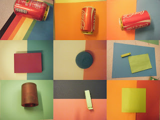
During this session we looked further into colour and the relationship of two colours together. Our first task was to arrange a colour wheel between the whole group, we used what we had been taught in the previous lesson to arrange the objects in accordance to each other. This task prepared us for what we had to do next, which was get into pairs or groups of three and choose 5 items from what we had brought in and 5 items of the opposite colour on the colour wheel.

We arranged the various items that we selected on coloured paper of different variety. The aim of the task was to show the contrast between the colours and how they related to the background colour they were placed on.

Saturday, 7 November 2009

Colour Theory Part 1

Colour Theory Part 1

Our task was to bring in 10 different objects of a certain colour, I was given the colour green. We then split into colour groups and asked to organise the colour in an appropriate order, we chose to order the colours from light to dark green.


After we had organised the various objects that our group brought in we had to select 10 objects. We had to use these 10 items to compare to the pantone swatches, also being limited to 2 swatches for this exercise. For each item we had to take note of the pantone number and the CMYK values of the colour. Some items were a lot harder to match up due to the texture of the material, like the spray trigger off the cleaning bottle because it was a reflective surface the colour seemed to change in various lights due to the reflection.


Tuesday, 27 October 2009

Visual Vocabulary

This visual language task was to use the various sized box s that we each had to bring in as a group to create a letter form when looking at a specific angle through the viewfinder. We choose to do a lower case a, as we wanted to challenge ourselves by using various lines and curves. From any other angle the letter form is unclear and just looks like an assortment of box s, this task is very similar to the channel 4 indents. Here are some photos that I took to record our progress:

Initial Idea- Photo was taken and printed off with a translucent overlay of the letter.


Final outcome- Photo looking through the viewfinder