
Showing posts with label Brief 02: Akzidenz minimal. Show all posts
Showing posts with label Brief 02: Akzidenz minimal. Show all posts
Tuesday, 13 December 2011
Final Boards
Brief 01 the Barman Brief 02 Akzidenz Minimal Brief 03 Language Supplement 04 Brief the Waitress Brief 05 Louise Tiler
Monday, 12 December 2011
Akzidenz: Website
I went for quite a striped back website with the various pages having movable products that the user can move. Each product can be enlarged by clicking on it which also brings up the details of that particular item.
Web 1
Web 1
Akzidenz: Product range
Similar to the posters, everything in the range is there to purchase so I have included, tote bags, t-shirts and stationary.


Akzidenz: Final posters for print
These are the five that I chose to print, each one of the posters showcases the variations available from the 3 variations and 3 weights available. As there isn't enough time I would have ideally liked to try out one or two screen printed but with everything drawing to a close it is something that I am thinking about expanding after the deadline for a potential portfolio piece. With screen printing I can also try an expanse of colours and stocks potentially.
Akzi Final Posters Print
Akzi Final Posters Print
Thursday, 8 December 2011
Akzidenz: Poster development
I took some of the initial scamps and decided to digitalise them, I want to find a suitable way to showcase the typeface, having the posters work on there own and come together as a set of prints.
Akzi Poster Dev 2
Akzi Poster Dev 1
Akzi Poster Dev 3
Wednesday, 7 December 2011
Tuesday, 6 December 2011


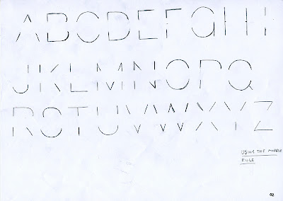
Developing the reduced weight
Developing the reduced minimal letters. Applying the rule and grid to the letters and seeing what the outcome is.
After experimenting with the various different grids and areas

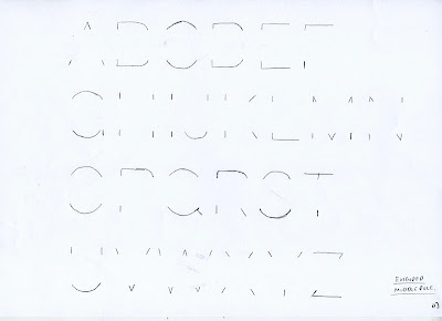


After experimenting with the various different grids and areas


Monday, 5 December 2011
Akzidenz: Look book test
Just put together the amount of spreads that the look book would have when it is cropped and bound. Looking at various different sized sleeves to go round the cover of the book. Full sized sleeve that wraps round the whole cover, with 5mm tabs on the inside of the cover for any potential editors notes or images.


 6mm in width this is the smallest of the sleeves.

Half sized sleeve for the cover, slightly favouring this over the other two as it is a reasonable size so that it wont be flimbsy when wrapped round the cover. The idea is to encourperate the typeface into the cover laying it out in a grid format and using the sleeve for the title of the book rather than duplicating the information on both cover and sleeve.


Half sized sleeve for the cover, slightly favouring this over the other two as it is a reasonable size so that it wont be flimbsy when wrapped round the cover. The idea is to encourperate the typeface into the cover laying it out in a grid format and using the sleeve for the title of the book rather than duplicating the information on both cover and sleeve.

Defining look book spreads order
Before I start the look book I wanted to make sure that the whole publication fitted together so that the weren't any blank pages when it comes to finalising the file ready for print.
The original page order for the look book. Not thinking about how the book would go together I decided on 14 pages which looking back is a stupid mistake as books/magazines are designed to be paginated in multiples of 4, so I decided to increase the amount of pages to 20.

 As this s a publication showcasing the typeface increasing the amount of pages is a good idea. I want to include a spread for each weight have a brief explanation of the process of how I worked on the typeface and various page breaks to show certain elements of the typeface which will link into the posters. I chose to include the page breaks as it would change the pacing of the book meaning that the viewer wouldn't just be getting overwhelmed with the text.


Final proposed order for the look book, this will make printing and designing easier know what the specific order is so everything can link together.
02 Look Book Proposed Cont
The original page order for the look book. Not thinking about how the book would go together I decided on 14 pages which looking back is a stupid mistake as books/magazines are designed to be paginated in multiples of 4, so I decided to increase the amount of pages to 20.


After chopping and changing the order I have come up with an order that I am happy with, making sure that there is no text on the inside of the cover as I want to keep it primarily on pages 3-22.

Final proposed order for the look book, this will make printing and designing easier know what the specific order is so everything can link together.
02 Look Book Proposed Cont
Sunday, 4 December 2011
Sizing and layout for look book
Looking at the sizes of the margins and workable space for the look book.


Document set up on InDesign before applying a grid to the format. The image below there is an extra guide 10mm from the bottom to take into account the page numbering or footnotes cut off point. With the layout I wanted to keep the design higher up the page so that it looks lighter and easier to read having the page numbering anchoring each spread.


Page numbers could be set in the typeface.

Defining look-book format
Re-visiting the format I came across a problem with my idea in that the descriptions I originally want to implement will impede on the space for the images in the look book. Another problem with the format is that the pages are harder to bind and I would have to come up with a way of efficiently binding it together but don't have enough time to do this as time is running out.
I have had a couple of ideas for the format and sizing of the look book. I want to keep it small but at the same time maximise the space in the double page spreads to showcase the typeface.
C5 (229mm x 162) with a double page spread size of 324mm x 229mm.
 I want to either have the look book wrapped in a belly band or have a sleeve wrap on it.
 B6
B6


C5 (229mm x 162) with a double page spread size of 324mm x 229mm.


C6


I think that the formats B6 and C6 are to small for what I want to produce and will be going for the C5 format.
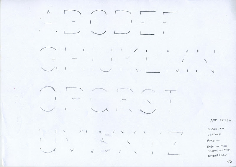
Akzi Formulating a grid
Starting with the grid that I proposed I found that fitting the grid to the size of the letters often provided a different result for each letter. This isn't particularly what I am looking for as I want the typeface to work as a set. Moving on from this grid and looking at enlarging the grid so that it was scalable and each letter being able to fit with the grid provided with better results.


Starting to look at various ways in which sections of the grid could be used to take away the strokes from the various letters. The grid has to work for each letter, number and glyph. The grids that seemed to work best where a section of horizontal modules are shaded in.

Just a couple of example of applying the various grids into practice.

Saturday, 3 December 2011
Akzidenz: Clarify the direction
As I am doing quite a bit of experimentation with dissecting the typography I wanted to take a minute to think about the direction that I am heading in. At the moment I have various visual variations of Akzidenz minimal, trying to come up with a rule/ set of rules that I can apply across the range of letters. Looking at other typefaces, most typefaces come within a font family such as Univers which was created by Adrian Frutiger. Univers like many other comes in various weights, widths and positions such as light, light oblique all the way through to black extended.
Having a mini crit with Ben bouncing around ideas, one of the ideas was to use and develop a series of the variations to create a font family, similar to conventional font families but maybe add my own spin on it.
As the typeface is going to be called Akzidenz minimal it could be the various was in which to increase or decrease how minimal the letter forms are.


As I have done a variation of different ideas deconstructing the letter forms up until now the process hasn't had a particular rigid rule or structure that I could apply to the different letters. I have started to look into using a grid an potentially using various modules within the grid to apply a constraint for me to apply to. The grid I am starting with is measured from the width of each letter by the base line to the cap height.

Akzidenz look-book format re-think
Before I started putting together the look book I want to get the sizing and format spot on so when it comes to laying it out and producing the look-book there are as little problems as possible.


A and G letter development
I wanted to focus on a few letters within the 26 letters, glyphs and numerals and try and push them further to make them more unique and easily recognizable within the typeface. I have started with a and g as it is the two starting letters of the original typeface. The idea is to experiment with the different strokes and how they join together with the emphasis on having limited strokes for each letter.


I started to look at how the a and the g interact with each other to create a single letterform for both the letters.

This is the direction I am heading towards dissecting the letterforms, moving more towards a stencil aesthetic but I don't want this to be the main driving force behind the design direction, I still want the letters to have more solid bowls.


Subscribe to:
Posts (Atom)